In the last month, I have found myself pair programming with three different people. All three times involved working on the LMFDB. I rarely pair program outside a mentor-mentee or instructor-student situation.1 1and to be fair, one of these was mostly me showing someone how to contribute to the LMFDB.
This is fun. It's fun seeing other people's workflows. (In these cases, it happened to be that the other person was usually the one at the keyboard and typing, and I was backseat driving). I live in the terminal, subscribe to the Unix-is-my-IDE general philosophy: vim is my text editor; a mixture of makefiles, linters, and fifos with tmux perform automated building, testing, and linting; git for source control; and a medium-sized but consistently growing set of homegrown bash/python/c tools and scripts make it fun and work how I want.
I'm distinctly interested in seeing tools other people have made for their own workflows. Those scripts that aren't polished, but get the work done. There is a whole world of git-hooks and aliases that amaze me.
But my recent encounters with pair programming exposed me to a totally different and unexpected experience: two of my programming partners were color blind.2 2Coincidence.
At first, I didn't think much of it. I had thought that you might set some colorblind-friendly colorschemes, and otherwise configure your way around it. But as is so often the case with accessibility problems, I underestimated both the number of challenges and the difficulty in solving them (lousy but true aside: most companies almost completely ignore problems with accessibility).
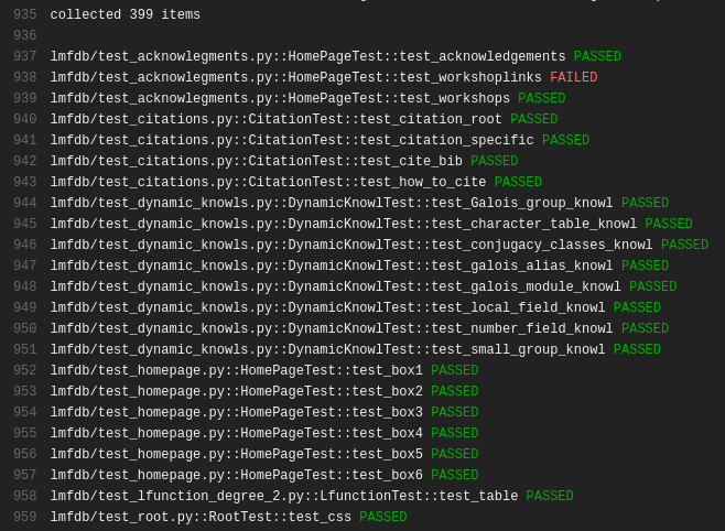
I first noticed differences while trying to fix bugs and review bugfixes in the LMFDB. We use Travis CI for automated testing, and we were examining a build that had failed. We brought up the Travic CI interface and scroll through the log. I immediately point out the failure, since I see something like this.3 3It was a different set of failures somewhere mid-test. I just took the most recent failing build as examples.
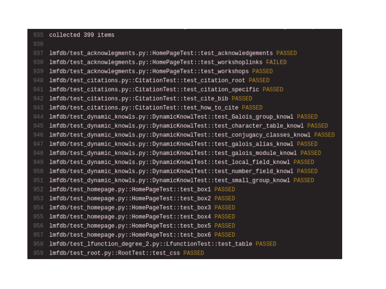
 How do you know something failed? asks John, my partner for the day. Oh, it's because the output is colored, isn't it? I didn't know. With the help of the color-blindness.com color-blindness simulator, I now see that John saw something like
 With red-green colorblindness, there is essentially no difference in the shades of PASSED and FAILED. That's sort of annoying.
We'd make a few changes, and then rerun some tests. Now we were running tests in a terminal, and the testlogs are scolling by. We're chatting about emacs wizardy (or c++ magic, or compiler differences between gcc and clang, or something), and I point out that we can stop the tests since three tests have already failed.
He stared at me a bit dumbfoundedly. It was like I had superpowers. I could recognize failures without paying almost any attention, since flashes of red stand out.
But if you don't recognize differences in color, how would you even know that the terminal outputs different colors for PASSED and FAILED? (We use pytest, which does). A quick look for different colorschemes led to frustration, as there are different sorts of colorblindness and no single solution that will work for everyone (and changing colorschemes is sort of annoying anyway).4 4This leads to small but significant differences. Our test suite takes approximately 15 minutes to run in full, and a nontrivial amount of time to run in part. Early error recognition can save minutes each time, and minutes add up.
I should say that the Travis team has made some accessibility improvements for colorblind users in the past. The build-passing and build-failing icons used to be little circles that were red or green, as shown here.
 That means the build status was effectively invisible to colorblind users. After an issue was raised and discussed, they moved to the current green-checkmark-circle for passing and red-exed-circle for failing, which is a big improvement.
The colorscheme used for Travic CI's online logs is based on the nord color palette, and there is no colorscheme-switching option. It's a beautiful and well-researched theme for me, but not for everybody.
The colors on the page are controllable by CSS, but not in a uniform way that works on many sites. (Or at least, not to my knowledge. I would be interested if someone else knew more about this and knew a generic approach. The people I was pair-programming with didn't have a good solution to this problem).
Should you really need to write your own solution to every colorblind accessibility problem?
In the next post, I'll give a (lousy but functional) bookmarklet that injects CSS into the page to see Travis CI FAILs immediately.
Info on how to comment
To make a comment, please send an email using the button below. Your email address won't be shared (unless you include it in the body of your comment). If you don't want your real name to be used next to your comment, please specify the name you would like to use. If you want your name to link to a particular url, include that as well.
bold, italics, and plain text are allowed in comments. A reasonable subset of markdown is supported, including lists, links, and fenced code blocks. In addition, math can be formatted using
$(inline math)$or$$(your display equation)$$.Please use plaintext email when commenting. See Plaintext Email and Comments on this site for more. Note also that comments are expected to be open, considerate, and respectful.