I recently gave a talk about different visualizations of modular forms, including many new visualizations that I have been developing and making. I have continued to develop these images, and I now have a proposal for new visualizations for modular forms in the LMFDB.
To see a current visualization, look at this modular form page. The image from that page (as it is currently) looks like this.
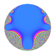
This is a plot on a disk model. To make sense of this plot, I note that the real axis in the upper-half-plane model is the circumference of the circle, and the imaginary axis in the upper-half-plane model is the vertical diameter of the circle. In particular, $z = 0$ is the bottom of the circle, $z = i$ is the center of the circle, and $z = \infty$ is the top of the circle. The magnitude is currently displayed — the big blue region is where the magnitude is very small. In a neighborhood of the blue blob, there are a few bands of color that are meaningful — but then things change too quickly and the graph becomes a graph of noise.
I propose one of the following alternatives. I maintain the same badge and model for the space, but I change what is plotted and what colors to use. Also, I plot them larger so that we can get a good look at them; for the LMFDB they would probably be produced at the same (small) size.
Plots with "Contours"
I have made three plots with contours. They are all morally the same, except for the underlying colorscheme. The "default" sage colorscheme leads to the following plot.
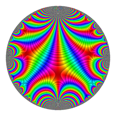
The good thing is that it's visually striking. But I recently learned that this colorscheme is hated, and it's widely thought to be a poor choice in almost every situation.
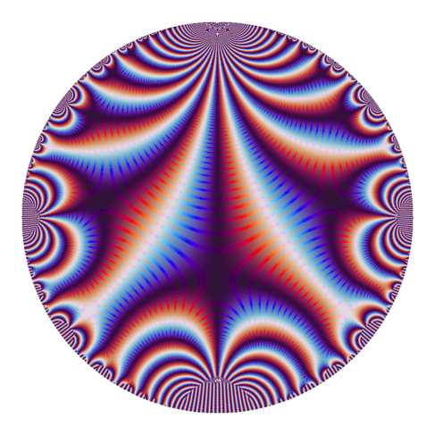
A little bit ago, matplotlib added two colorschemes designed to fix the problems with the default colorscheme. (sage's preferences are behind — the new matplotlib default has changed). This is one of them, called twilight.
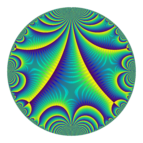
And this is the other default, called viridis. I don't actually think this should be used, since the hues change from bright yellow to dark blue at complex-argument pi to negative pi. This gives the strong lines, which correspond to those places where the argument of the modular form is pi.
Plots without Contours
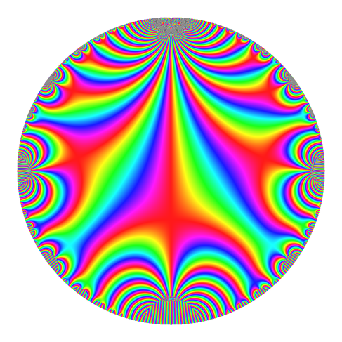
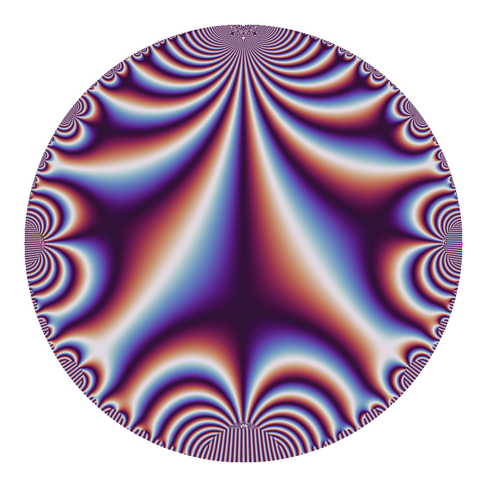
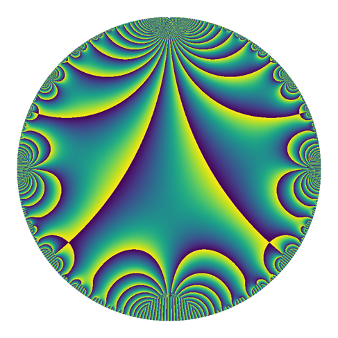
I've also prepared these plots without the contours, and I think they're quite nice as well.
First jet.
Then twilight. At the talk I recently gave, this was the favorite — but I hadn't yet implemented the contour-plots above for non-default colorschemes.
Then viridis. (I'm still not serious about this one — but I think it's pretty).
Note on other Possibilities
There are other possibilities, such as perhaps plotting on a portion of the upper half-plane instead of a disk-model. I describe a few of these possibilities and give examples in the notes from my last talk. I should note that I can now produce contour-type plots there as well, though I haven't done that.
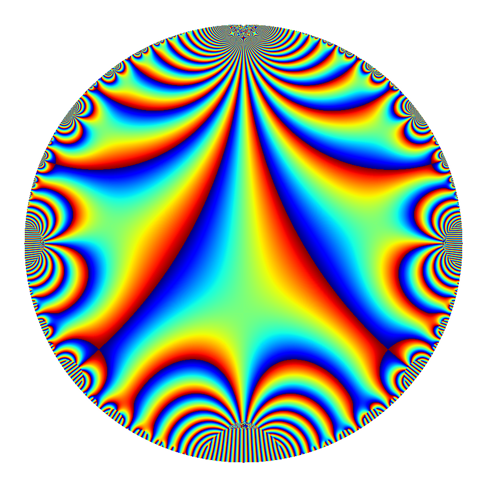
For fun, here is the default colorscheme, but rotated. This came about accidentally (as did so many other plots in this excursion), but I think it highlights how odd jet is.
Gathering Opinions
This concludes my proposal. I am collecting opinions. If you are struck by an idea or an opinion and would like to share it with me, please let me know.
Info on how to comment
To make a comment, please send an email using the button below. Your email address won't be shared (unless you include it in the body of your comment). If you don't want your real name to be used next to your comment, please specify the name you would like to use. If you want your name to link to a particular url, include that as well.
bold, italics, and plain text are allowed in comments. A reasonable subset of markdown is supported, including lists, links, and fenced code blocks. In addition, math can be formatted using
$(inline math)$or$$(your display equation)$$.Please use plaintext email when commenting. See Plaintext Email and Comments on this site for more. Note also that comments are expected to be open, considerate, and respectful.